
Modelling epidemics to learn about probability
My major focus in my work at the Adult Education Centre has been adapting online courses for the Hybrid Learning Project. Basically, these are high school courses adult learners can complete online, but there is also an in-person tutorial component to them. I’ve been adapting the e-Learning Ontario MDM4U (Grade 12 Data Management) course. I’m almost done.
I could write an entire post about this assignment and how I feel about it, but that’s for another time. Instead I want to share something cool I made for the course.
When I hit the lesson on experimental probability, the assignment was basically, “Create an experiment and perform it ten or twenty times and then estimate the experimental probability.” Yeah. As if someone doing an online course would really do that.
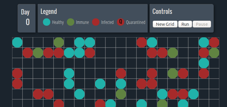
So I searched for some kind of interactive resource—and I found this NRICH activity on modelling epidemics. It’s a neat Flash applet that lets you adjust variables and then simulate an epidemic in a village. After each epidemic finishes, the simulator calculates the mean and standard deviation for a few different variables. The idea is that students should adjust one variable at a time and then hypothesize what effects this will have on the results of the epidemic.
I loved the idea, so I turned it into the assignment for that lesson. I created a document with some guidelines, instructing the learner to conduct five trials with the initial configuration, then change one variable, make a hypothesis, and conduct another five trials. Rinse and repeat a few times. Then use all that stats terminology they should have from the first half of the course to analyze the results.
As much as I loved the activity, I wasn’t happy that it uses Flash. It was once true that Flash was the king of interactive content on the Web; if you wanted interactivity, you needed Flash. Those days are long gone, however, and Flash is feeling clunkier with each passing month—not to mention the incredible security holes people keep finding that require all those updates you have to download. In this case, the Flash applet can’t be resized or zoomed, making it harder to make accessible. Plus, with Flash unsupported in iOS and barely supported in Android, the applet won’t work well on most mobile devices.
So I decided to rebuild it. I did have the technology. I stuck the concept of the original pretty closely. There are a few notable improvements, however. Adjusting the variables should be easier, and now the simulator will keep track of which variables you have adjusted between trials. When it detects a variable change, it will start calculating the mean and standard deviation anew without requiring you to clear the initial results. Hopefully, this should make it much easier to conduct the experiments and compare the effects of changing the variables.
Check out the new, shinier epidemic simulator. Read on if you want the technical details.
It’s all done in JavaScript, nothing server-side, so it will run in the browser and can be packaged up as part of the course on Desire2Learn.
The core came together last weekend. Despite not using JavaScript very often, I managed to cobble together the simulator component reasonably quickly. At first I resolved to do the entire project in vanilla JavaScript, all the better to make it a learning process for me. Soon, however, I started getting frustrated trying to manipulate the page DOM. I caved and started using jQuery (though I like to think of it as “stopped being so stubborn”). While I was building the simulator object, I had it drawing the grid using ASCII art. Even in its primitive state, with different characters moving around to signify the different types of villagers, watching the simulator run was entrancing.
I knew this was a perfect job for the canvas element, however. The plain canvas API isn’t that scary, but jCanvas makes it even easier to learn. My requirements weren’t that complex, either. I considered creating actual images for each type of villager—little smiley or sad faces depending on their health—but the way the grid resizes depending on its dimensions and the screen size means it would be hard to make out the details at smaller sizes. I think the circles communicate the information clearly enough.
When I began to work on the design, I decided to use this as an opportunity to learn Flexbox. Although flexbox has been around for a few years now and is supported by the majority of modern browsers, there are enough people out there on legacy browsers to stymy its adoption. This is unfortunate, because Flexbox is wicked. I was excited when I learned I could create linear gradients in CSS3; that’s nothing compared to how much I enjoyed flexbox. The initial syntax and its effects take some adjustment, but I have never had a layout come together so quickly.
Using flexbox means that the design breaks in older versions of browsers. Other than Internet Explorer, I’m not too concerned, because other browsers have a pretty easy and insistent upgrade path. As far as IE goes, the simulator will work in anything above IE 8—it just doesn’t necessarily look great.
I had a great time bending my coding hobby towards a practical classroom use, and I enjoyed learning some new skills while I was at it. All of the code (with the exception of the jQuery and jCanvas libraries) is in the public domain, so if you have the inclination, please take it and make it better.